Translating clinical burnout research into a mobile app
that users can act on daily
Oculo Health is an MIT-founded, venture-backed startup building the first app to measure cognitive burnout through eye-tracking and AI.
Product designer
I owned three core sections: the Burn page, the Today page, and the History page: from problem framing through 15+ iterations to engineering handoff.
Figma, Photoshop
Jan — Jun 2023
* Outcome
Oculo launched in closed beta. Outcome data from testing is confidential. The metrics I can speak to are process metrics — what was built, tested, and validated before handoff.
0-to-1, design system
from scratch
No prior design foundation; color tokens, component library, and interaction states built across all five product sections.
15+ iteration rounds
Running in parallel across Burn, Today, History, Inputs, and Burn pop-up; 3 competing Logbook models evaluated before resolving into one direction.
10 usability sessions
Burn state legibility, habit-tracking speed, and History comprehension were each tested separately.
Acquired by Vyome Holdings
Seed round closed during the design sprint in 2023. Technology now powers a clinical mental health platform.
* Context & problem
Burnout is an invisible physiological state.
Nearly 50%
American office workers experience burnout.
91%
Professionals report stress that impacts their work quality.
63%
Chronically burned-out employees more likely take sick days.
And the long-term consequences go beyond productivity: burnout correlates with cardiovascular disease, diabetes, and premature mortality.
120,000
Annual deaths because of workplace stress.
$190 billion
In healthcare costs in the US alone.
The problem is that people have no way to measure it. Without an objective signal, they guess wrong. They push through fatigue on days when they're running on empty, and they rest on days when they're actually primed for deep focus.
Oculo's bet: eye-tracking and AI can make cognitive load measurable in real time. Four years of clinical research and algorithms built on sleep science and the Human Brain Project sit behind a single daily score that called "Burn", that tells you where your brain actually is today.
* Challenges
The design challenge was trust. A burnout percentage only feels meaningful if users believe it. That belief requires two things to work together — an emotional signal they can feel instantly, and a data trail transparent enough to interrogate. Too much of one breaks the other.
And behind the main screen, a deeper problem: cognitive performance data is only useful if people input it consistently. The Logbook — where users track supplements, screen time, sleep quality, and lifestyle factors — was the engine the whole app depended on. If users didn't fill it in, the Burn score became guesswork. Designing the Logbook was as much a behavior design problem as a UX one.
* Business goals
Oculo needed to do three things at once: bring users in, keep them coming back, and make them believe the data.
Grow the first users' base
The product's novelty is the acquisition hook; scientific framing can't get in the way.
Drive daily retention
A burnout score only has value over time. The app had to become a ritual.
Earn trust in the data
Too clinical and users disengage; too vague and the score feels arbitrary. Both had to be true at once.
* My role & approach
I joined as a product designer under the design lead, responsible for UX logic, states, and interaction design across three sections: Burn, Today, and History. The design lead set the overall visual system; I owned the problem-solving within it.
My process across the project followed four stages:
Research & frame
Map hypotheses
Design structurally
Test & iterate
* Behavioral research
I started by learning how habits actually form and break.
Duhigg's habit loop (The Power of Habit) shows that people replace one ritual with another.
Fogg's habit stacking model (Tiny Habits) reinforced this: the most durable new behaviors attach to something the user already does every day.
This reframed the Logbook problem entirely:
the question became "what existing ritual can we attach it to?"
* Benchmarking
Three apps, three lessons
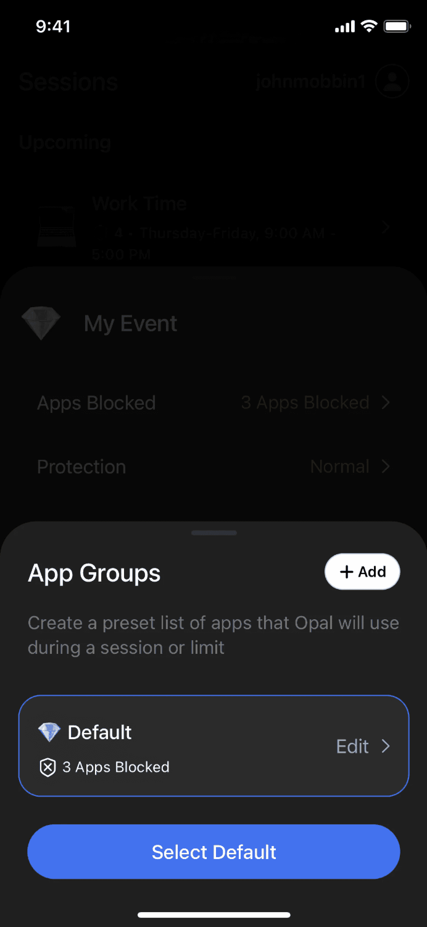
Opal: friction
as a mechanism
It makes you name your distractions before blocking them, even exiting
a session.

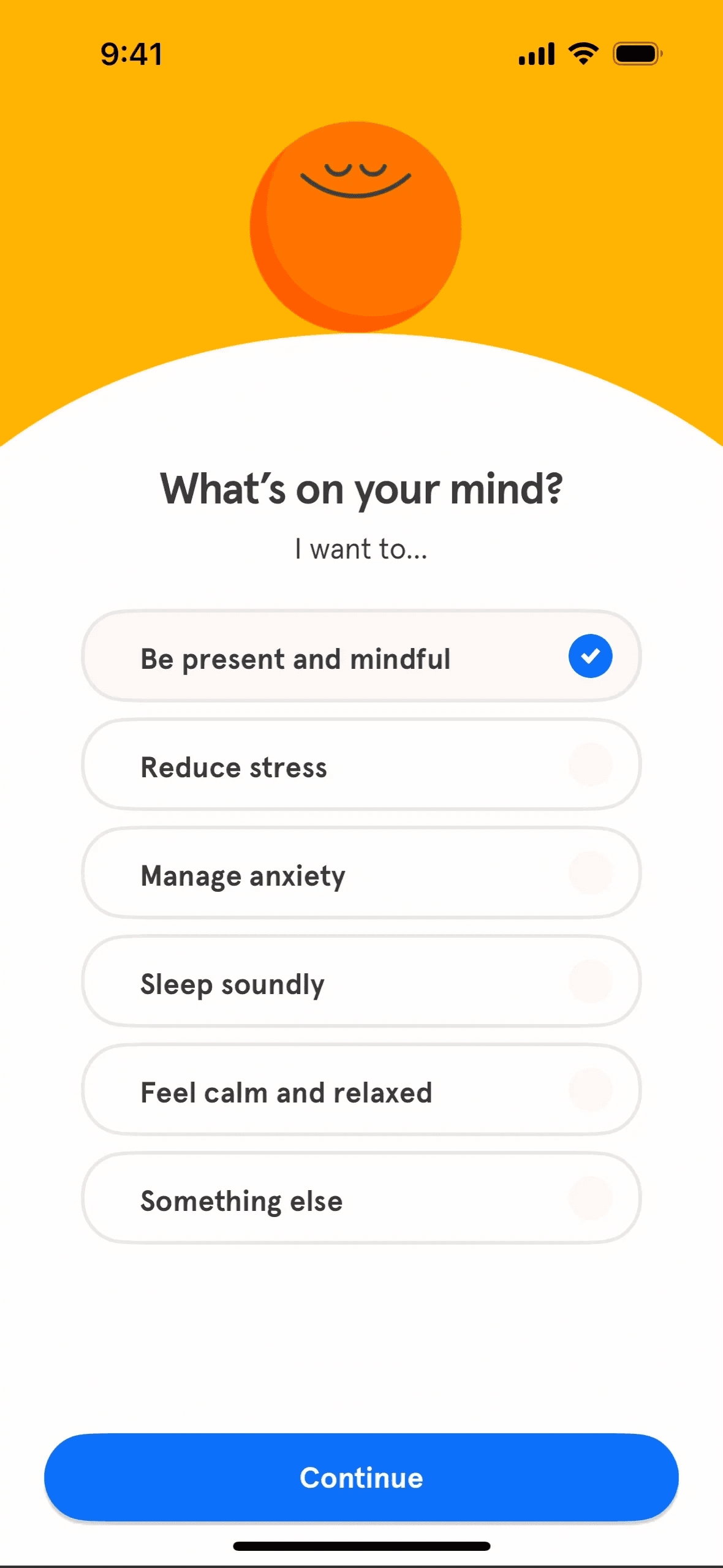
Headspace: solving
the cold start
Day 1 asks you to anchor meditation
to an existing routine. But Day 30 shows content that already knows you. The gap between them is a design problem.

Rise Science: "now"
beats "today"
Sleep debt on one screen, time-specific energy plan on the next. Recommendations tied to a named window are more actionable than an open-ended daily list.


* Design principles
Four design principles that became the hypothesis foundation for each section.
Attach data entry
to an existing ritual
Build trust with redundancy: emotional signal & data trail
Progressive disclosure: Show more only when asked
Defaults shape behavior: what's preset is what most users will keep.
* Iterations & Validation
I worked in three focused loops, each starting
from a hypothesis and ending with what real use revealed.

Burn: H1
If percentage and copy are the primary signal, users will understand their state without needing a visual shape.
Insight
Users could read the number but couldn't feel it. Red only activated at extremes. Moderate burn had no visual signal. Icons added context, but cluttered the card.

Burn: H2
If we introduce a circle as a shape signal alongside the percentage, users will read state faster than with text alone. Horizontal card layout kept more space for reading.
Insight
The circle added a new signal, but lost impact at small size. The horizontal layout spread state information too wide. Users scanned left-to-right and missed the key data.
Burn: Final
If the circle is large enough to read as a state before the user processes the number, users will get both an emotional signal and an actionable next step in one glance.
Result
Large circle as the primary read, descriptive copy as reinforcement, focus prediction below. Full state spectrum: Burnout (97%), High (78%), Moderate (45%), Low (15%), Adding data, Empty.

Trade-off
Three-layer redundancy adds visual weight — the orb risks feeling decorative if the color mapping isn't learned quickly.
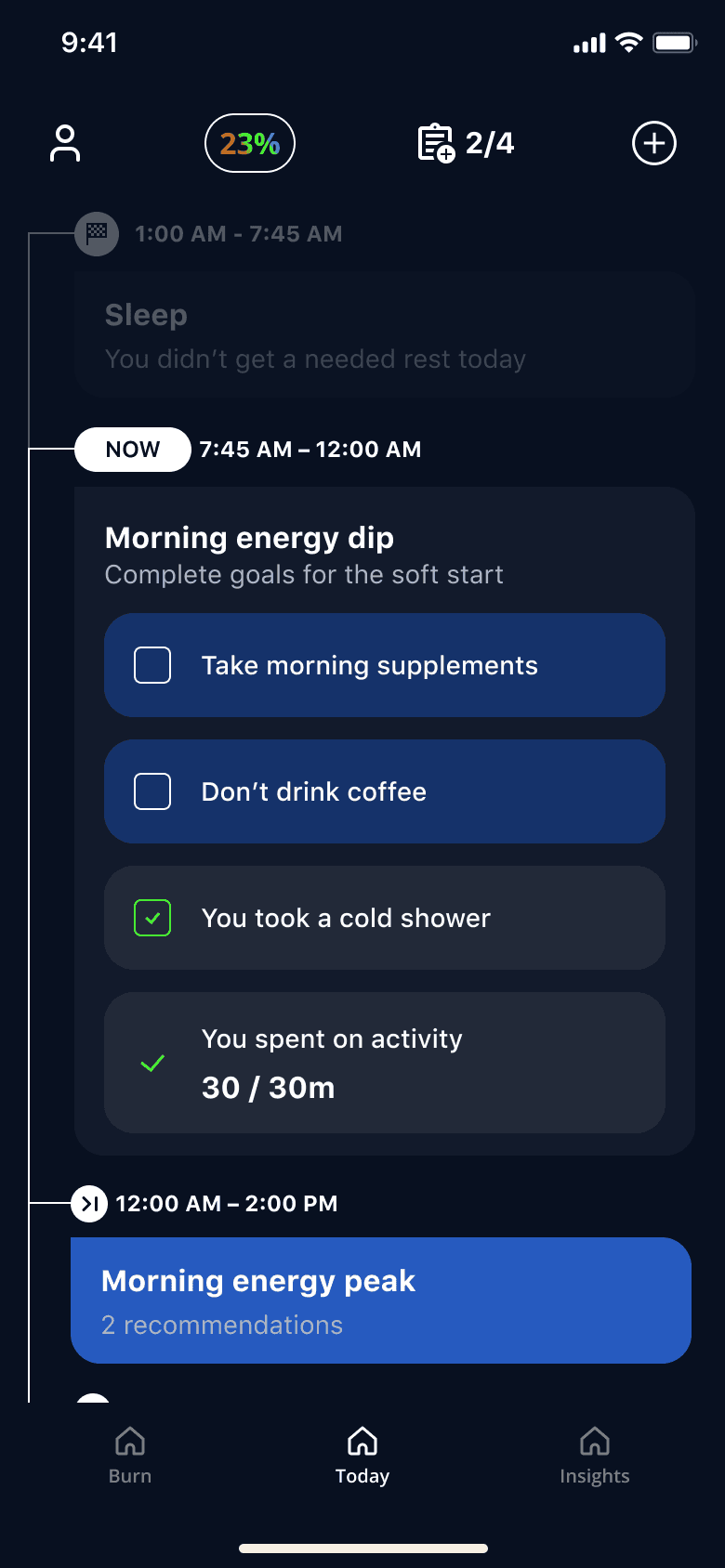
Today page: H1
If the day is structured as Peak & Dip intervals with different content per state, users will know what to do at each moment.
Dip is task checklist with progress.
Peak is active focus timer.
Insight
Intervals were clear, but users couldn't connect them to action. "I'm in a focus peak — now what?"

Today page: H2
If recommendations are shown inside each interval and users can convert them into personal goals via a setup flow, the page will feel actionable rather than informational.
Insight
Most users skipped it and stayed in recommendation mode without ever personalizing the page.
The "Set as my goals" button added a setup step that felt like homework.
Today page: Final
If goal-setting is built into the eye-test onboarding, the Today page arrives personalized on day one — no separate setup screen required.
Result
Sleep summary at the top. Focus intervals rewritten around action — users immediately understood what to do at each moment without tapping into a pop-up.
Trade-off
The page is only as strong as the goals set during onboarding: weak day-one input produces a weak daily experience throughout.
History: H1
If the page is built around scientific health metrics—sleep, activity, and tracked habits—users will understand their cognitive patterns over time.
Insight
Users didn't see a reason to return. The data felt clinical and disconnected from Burn: no throughline between the metrics and their cognitive state.
The founder's scientific framing worked against retention.
History: H2
If a calendar is the primary navigation and metrics include Burn data alongside sleep, focus, and logbook, users will see their health in context.
Insight
The calendar worked, but consumed the full screen.
Burn dynamic was the right idea in the wrong format.
History: Final
If the weekly strip always stays visible and the metric detail opens on tap, users can navigate by date first and understand the data second—without switching views.
Result
The strip freed screen space for metric detail. Users read the average burn-through calendar color. Sleep comprehension improved: the wake-up timeline was easier to interpret than a score.
Trade-off
Three interaction layers require users to learn the navigation model before getting full value. Discoverability depends on willingness to explore.
* What we cut
Two complete gamification models were prototyped and tested as an attempt to solve the motivation gap on the Today page.
Points & levels
Complete goals → earn daily points → level up → unlock customization and the Insights page.
The loop included a Daily Summary screen after each eye-test showing focus and goal completion, reminders tied to flows with goals, and a points progress bar (0–500) on the Today page.
Insight
Users optimized for points rather than understanding their cognitive state. The mechanic worked against the product's scientific positioning.


Accuracy over time
Log habits consistently regardless of whether they're "good" or "bad" → after 14 days, the app improves Burn prediction accuracy → unlocks the Insights page.
The Customization Summary showed accuracy as a percentage, and the Today page shifted to a task score format.
Insight
Users responded well to the idea of a smarter app as the reward. But the accuracy payoff was invisible for the first two weeks, too long to sustain cold-start engagement.

Results
Why they were cut
Both models added decision complexity that slowed down daily logging. It was the opposite of what the app needed.
User feedback and founder alignment pointed to the same conclusion: remove from MVP scope.
What this taught me
Both directions were built to meaningful fidelity before any user validation.
A lighter prototype could have surfaced the core issue faster and freed iteration time for the cold-start problem, which was the harder challenge.
* Learnings
Working within an established design system under a lead taught me the difference between executing a vision and owning a problem space.
What I'd do differently
Start with behavior design. We researched habit formation midway through: habit substitution, trigger-routine-reward loops, how Headspace and Opal handle daily re-engagement. That research changed how I thought about the Logbook entirely. It should have been the starting point, not a mid-project correction. The interface question is secondary to the behavioral one.
Design the empty state first. Every section has an empty state, a loading state, and a data-unavailable state. In practice, these were designed after the populated happy path. But the empty state is often what a new user sees on day one. It should be designed in parallel.
Test the gamification hypothesis before building two complete directions. Both gamification models were developed in meaningful detail before any user validation. A lighter prototype could have helped make the call faster and freed up iteration time for the cold-start problem, which was the more important challenge.
* Keep reading

