Auditional is a career-management tool for actors. A place to track auditions, callbacks, bookings, and payments that usually live scattered across spreadsheets, emails, and paper.
Figma, Photoshop
Jan 2023 — Apr 2023


* Outcome
I designed Auditional end-to-end: auditions dashboard, booking, analytics, financials — plus a Chrome extension
and marketing site.
Moreover, I developed a design system from scratch: components, patterns, and the visual language the product runs on. Built to hold a fast 0→1 build together and give the team something to scale on."
Measured in usability testing before launch (I had no access to production data after handoff):
~80% less admin time
~38% higher form completion
Breaking the audition form into four focused steps reduced drop-offs in testing.
~40% faster information retrieval
* Context & problem
Our users
Joyce
A career changer who takes organisation seriously. Wants control, reliability, and to track every audition and payment without losing anything between jobs.
Jade
Roxy
A driven actor who finds tracking boring. Wants to stay on top without it feeling like a second job, with visual feedback that makes progress satisfying.
What users faced with


* Business goals
Acquisition
The product only wins if actors switch from tools they already trust (their own spreadsheets). Onboarding and first-run had to prove the value fast enough
to pull them over.
Retention
Demonstrating value
Actors had to feel the product doing work their spreadsheet couldn't: surfacing what's urgent, tracking what's owed.
Monetisation
* Challenges
A 3-month deadline for everything. The full product: web app, Chrome extension, marketing site, research
and a design system, in 3 months. That forced tight prioritisation and building the system alongside the flows rather than after them.
Designing for an emotional problem. Actors' biggest pain
was the anxiety of not knowing where they stood. The design had to reduce that anxiety.
* My role & approach
* User interviews


* Insights
Three patterns shaped the direction:
Tracking feels
like control
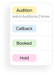
Color is how actors think
Time and money are part
of the craft
They track hours spent on classes, self-tapes, and exercise, and watch their expenses carefully. Career management is financial management too.
* Categories
Casting director and status together account for 67% of what actors check first, so I made them the most visible elements on every audition card.
Сasting director
39,3%
Status
27,8%
Date / Time
22,3%
Type
13,7%
Project role
11,3%
Wardrobe
9,4%
Relationship
8,6%
Pay
4,8%
* Benchmarking
From competitive benchmarking, three patterns shaped the direction:
No tools for actor
Insight
Takeaway
The biggest opportunity was to build the first product designed
around how actors actually think.
Tracking / acting
Time spent on admin vs. craft
Insight
Takeaway
Clarity / anxiety
Insight
Takeaway
* Iterations & tests
How the audition dashboard evolved
Organising auditions by production type will help actors find what they need faster.
Insight
Type existed without weight. Actors scanned every row to find what mattered. Status counts helped, but eight columns still slowed scanning.

New direction
Result
Actors found urgent auditions ~80% faster in testing, and the hover history was the most-mentioned improvement in post-test feedback.

Trade-off
From four forms
to one flow
Tailoring the form to each production type (Film, TV, Commercial, New Media) will make each one more relevant.
Insight
Testing showed that actors needed more clarity. Four types meant four flows
to learn. Tailored felt helpful, but created hidden complexity.

New direction
I unified it into one four-step accordion with type selection inside step one, so actors get a clear mental model before filling anything in.
Result
Trade-off
From data overload
to three focused views
Insight
New direction
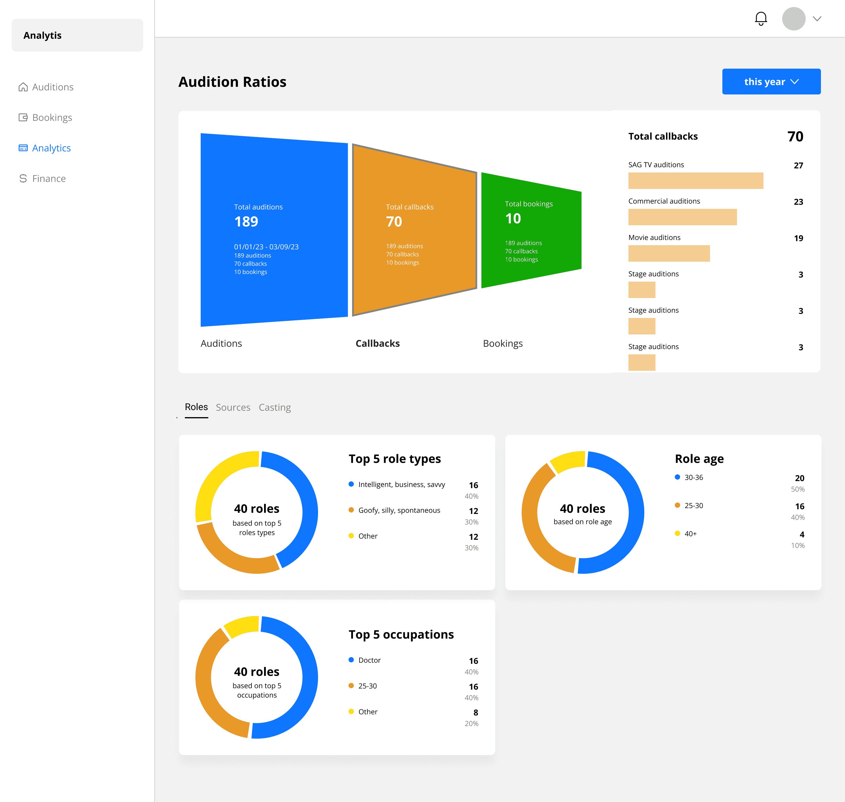
I replaced the funnel with a simple ratio indicator and a clear numerical breakdown, readable without visual interpretation, across three focused views.
Result
The ratio was readable in under five seconds. The structure survived every iteration.
Trade-off
From raw numbers
to career intelligence
Showing all financial data upfront will give actors complete visibility into their income.
Insight
Everything had equal weight. Actors needed to see what kind of work paid most.

New direction
I grouped key metrics into a clear summary panel, so the most important numbers were immediately readable.
Result
Actors understood where their income came from and which work type paid most. Finance stopped feeling
like bookkeeping.

Trade-off
* One UI kit, three products
The system behind every screen: colours, components, and the status and colour-coding patterns actors read at a glance, built from scratch as the core designer. It kept a 3-product, 3-month build consistent and gave the team
a base to scale on.
* Learnings
For a product fighting an emotional problem, structure carries the value more than features. Actors switched because status, progress, and money were visible at a glance, which is what their anxiety was really about.
