Re-architecting B2B invoicing: from MVP to daily driver
EasyBiz helps SMEs in Luxembourg register and run their business. I was the sole designer on the product, and owned invoicing end-to-end:from MVP 1.0 through
the redesign that followed as we grew to our first 100 users over 2025 and saw what broke at scale.
Founding product designer
owned invoicing end-to-end, validated with real users,
the back-office team,
and support feedback as we grew to our first 100 users over 2025.
Figma, Claude, Gemini, Perplexity
Feb 2024 — Apr 2026

* Outcome
I rebuilt EasyBiz invoicing from a card-based MVP
into a flow that holds up at real volume. Measured
with the support team after release, across all 100 users:
−30% support tickets
in the invoicing area
Users stopped forgetting to attach transactions. The single biggest recurring ticket type dropped off.
~2× faster booking
for the back-office team
Staff no longer had to chase users to fix or attach transactions, or hunt for half-filled invoices (back-office estimate).
* Context & problem
EasyBiz helps SMEs in Luxembourg register and run their business. I joined before launch and owned invoicing: from concept to MVP 1.0, then through the redesign that followed once real users started running volume through it.
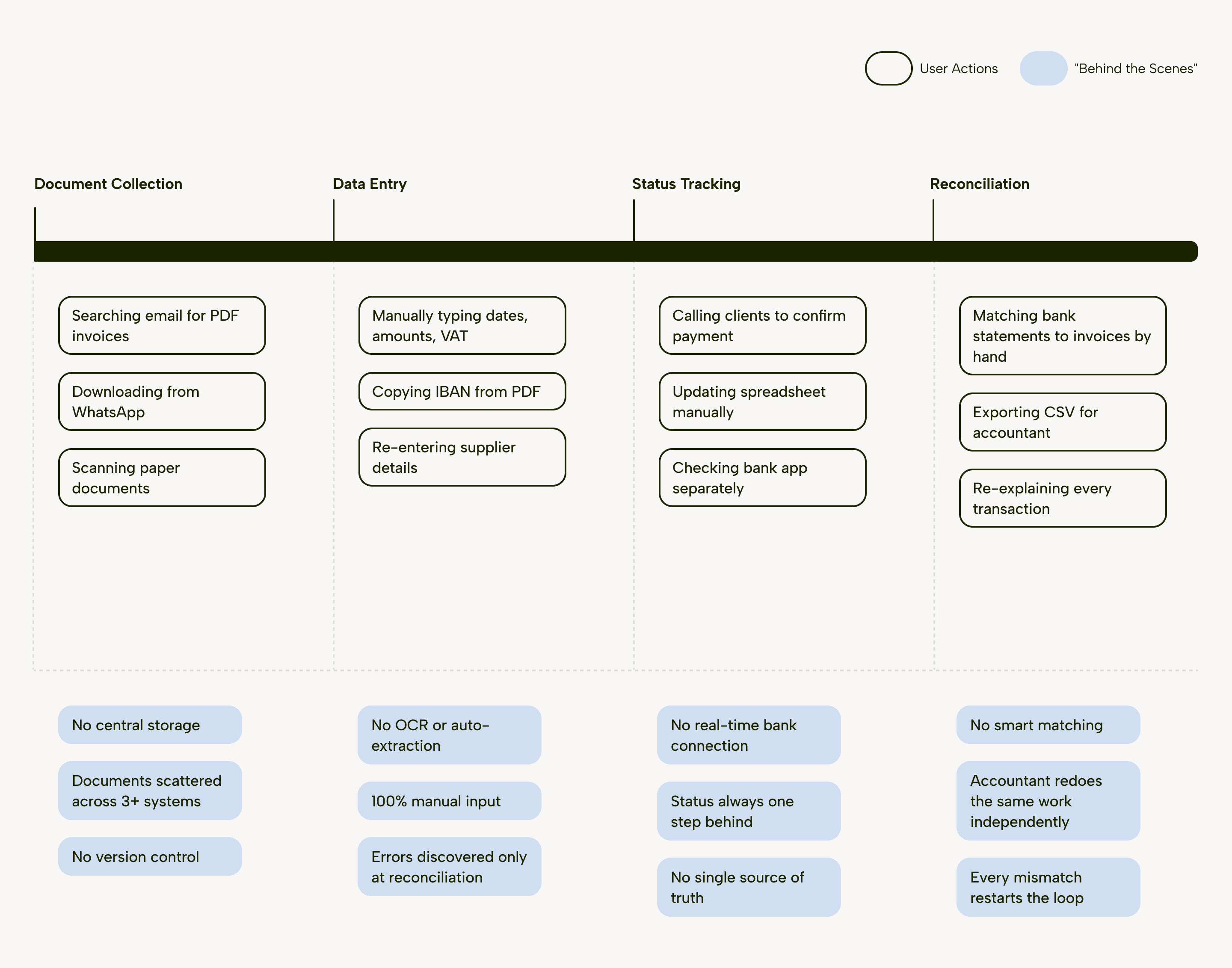
Every quarter, Luxembourg SMEs hit the same wall: a backlog of invoices to reconcile before the VAT deadline. Not because the work is hard, but because their tools don't talk to each other.
Our users
Solo owner
Runs 10–50 invoices
a month. Wants to know what's paid and never miss a deadline,
without thinking
about it.
Speed & simplicity
Growing SME
5–20 people with an accountant on payroll,
but reconciliation still eats days and VAT errors
are expensive to trace.
Accuracy & time back
Compliance-first founder
Fintech or professional services, where every transaction has
to hold up.
A defensible audit trail
What users faced with
* Business goals
Invoicing was a module SMEs touched every week that made it
a lever for the business. Four goals shaped the work:
Retention
A reliable invoicing flow is a reason to stay and renew. Invoicing had to become something users leaned on, not something they dreaded.
E-invoicing readiness
Being ready ahead of the deadline would turn a looming regulatory requirement into a competitive edge instead of a scramble.
Lower support load
Every recurring error turned into a support ticket. Designing those errors out would cut user frustration and support costs.
Scalability
The product had to hold up as users grew
from a handful of invoices to hundreds,
so the company could scale without a rebuild
* My role & approach
I was the sole designer on the product and owned invoicing
end-to-end: competitor audits and user research, flows
and information architecture, UI and interaction,
and the design system I built and maintained solo.
Working solo on a live product, I built a loop I could run fast and repeat:
Audit & frame
Hypothesise
Triangulate
Decide structurally
* Research
I audited how three market leaders: Finom, Qonto,
and Billy,handle the core invoicing jobs. I wanted to see where each draws the line between compliance and usability, and where EasyBiz could do better.
I also studied broader accounting products like Odoo: functionally deep, but visually heavy and hard to act
in quickly. That contrast set the bar: EasyBiz could win
on clarity where the incumbents won on features.

* Insights
Three patterns shaped the direction:
Status
builds trust
Qonto and Billy surface invoice status at every touchpoint: paid, pending, overdue. Users never have to dig.
Separation reduces errors
The best tools separate document collection
from review. Finom's two-step flow: "Upload first, review later", cuts misclicks
and cognitive load.
Smart defaults
beat forms
Billy and Finom pre-fill and suggest instead
of asking. The system should connect the dots, not the user.
The pivotal insight
It came once the MVP was live. My instinct had been to make each invoice look good: cards and the invoice preview on the same page, but it worked for ten invoices and broke for fifty.
The goal shifted from displaying it to making matching proactive and errors structurally impossible.
* Challenges
Speed versus compliance. SMEs needed speed, and Luxembourg tax law needed precision. Most tools treat compliance as friction bolted on top. I had to build it into the flow so it never became extra work.
Three users pulling in different directions. One flow had to serve a solo owner who wanted speed, a growing SME who wanted accuracy and time back, and a compliance-first founder who needed every transaction to survive an audit.
A form that outgrew its layout. As Luxembourg's VAT fields piled on, the inline invoice form ran out of room and users lost sight of the source document while typing.
* Design decisions
I worked in three focused loops, each starting
from a hypothesis and ending with what real use revealed.
Invoice list
A card layout will give each invoice enough visual space to show key details without overwhelming the user.
Insight
Testing at volume told a different story: past ~20 invoices, cards hid
the total picture. Users switched pages just to see their balance, and critical info got lost in the noise.

New direction
A table with a consistent status system (paid, pending, overdue), a financial summary up top, and a live import panel.
Result
Users scanned large lists at a glance, read their whole position through status colour, and errors surfaced during import instead of at month-end.
The table held hundreds of invoices without breaking.

Trade-off
I gave up the visual breathing room of cards for the density a table brings — a bet that my users grow in volume rather than stay at ten invoices.
Invoice details & form
Showing the invoice and form fields
in the same column keeps users
in context while reviewing.
Insight
The form grew faster than the layout could hold. Once Luxembourg's VAT fields piled on, users scrolled past
the invoice to reach the fields, context was lost and errors rose.

New direction
A full-width invoice with a scalable side form, so the data-entry area grows with compliance requirements
without hiding the source document.
Result
The document stayed in sight while VAT fields grew, and matching felt like confirmation, not guesswork. The mandatory VAT fields brought the form into line with Luxembourg requirements in the same move.

Trade-off
The dedicated view cost one extra step to open each invoice. I traded instant inline glance-ability for context during entry, betting that lost-context errors cost more than a moment's delay.
Reconciliation
Putting category, project, and date fields directly inside the transaction card lets users complete reconciliation in one place.
Insight
The card overloaded fast: too many fields in too little space,
and misclicks rose. Separating Match from Review kept every match traceable, so a misclick couldn't silently corrupt a record.


New direction
Before the user searches, surface AI-suggested transactions at the top
of the review panel: turning matching from a task into a confirmation.
Result
Users confirmed the right transaction
in one click instead of hunting for it. The full flow spans nine states, from AI suggestion to booked.
Trade-off
Suggestions-first risks confirming a wrong match on autopilot that is exactly why decoupling Match from Review was the safeguard, not an afterthought.
* One architectural bet
Not every decision lived on a screen. Early on, I structured the data model
to absorb mandatory e-invoicing with zero rework: betting the format would become law across EU. It was the least visible decision I made and the most strategic: when e-invoicing did become mandatory, EasyBiz was ready to slot it
in while competitors faced a rebuild.
* Learnings
The strongest lesson: at scale, structure beats warnings. The errors
that mattered didn't disappear because I told users to be careful, they disappeared because the architecture made them hard to make. Decoupling Match from Review did more for accuracy than any amount of validation copy could.
What I'd do differently
I'd test with real users earlier. My early validation leaned
on stakeholders and the back-office team. A small group of potential users in the room from the start would have surfaced the card-layout problem before it shipped, not after.
I'd analyse the market more critically at the MVP stage. My first
card-and-preview layout was grounded in research of products like Odoo: functionally rich, but visually heavy.
I took a cue from incumbents without questioning hard enough whether their patterns fit a product betting on clarity. The redesign was, in part, correcting for a direction I could have avoided.


Re-architecting B2B invoicing: from MVP to daily driver
EasyBiz helps SMEs in Luxembourg register and run their business. I was the sole designer on the product, and owned invoicing end-to-end:from MVP 1.0 through
the redesign that followed as we grew to our first 100 users over 2025 and saw what broke at scale.
Founding product designer
owned invoicing end-to-end, validated with real users, the back-office team, and support feedback as we grew to our first 100 users over 2025.
Figma, Claude, Gemini, Perplexity
Feb 2024 — Apr 2026
* Outcome
I rebuilt EasyBiz invoicing from a card-based MVP into a flow that holds up at real volume. Measured
with the support team after release, across all 100 users:
−30% support tickets
in the invoicing area
Users stopped forgetting to attach transactions. The single biggest recurring ticket type dropped off.
~2× faster booking
for the back-office team
Staff no longer had to chase users to fix or attach transactions, or hunt for half-filled invoices (back-office estimate).
* Context & problem
EasyBiz helps SMEs in Luxembourg register and run their business. I joined before launch and owned invoicing: from concept to MVP 1.0, then through the redesign that followed once real users started running volume through it.
Every quarter, Luxembourg SMEs hit the same wall: a backlog of invoices to reconcile before the VAT deadline. Not because the work is hard, but because their tools don't talk to each other.
Our users
Solo owner
Runs 10–50 invoices a month. Wants to know what's paid and never miss a deadline,
without thinking about it.
Speed & simplicity
Growing SME
5–20 people with an accountant on payroll, but reconciliation still eats days and VAT errors
are expensive to trace.
Accuracy & time back
Compliance-first founder
Fintech or professional services, where every transaction has to hold up.
A defensible audit trail
What users faced with
* Business goals
Invoicing was a module SMEs touched every week that made it a lever for the business. Four goals shaped the work:
Retention
A reliable invoicing flow is a reason to stay and renew. Invoicing had to become something users leaned on, not something they dreaded.
E-invoicing readiness
Being ready ahead of the deadline would turn a looming regulatory requirement into a competitive edge instead of a scramble.
Lower support load
Every recurring error turned into a support ticket. Designing those errors out would cut user frustration and support costs.
Scalability
The product had to hold up as users grew from a handful of invoices to hundreds, so the company could scale without a rebuild
* My role & approach
I was the sole designer on the product and owned invoicing
end-to-end: competitor audits and user research, flows and information architecture, UI and interaction, and the design system I built and maintained solo.
Working solo on a live product, I built a loop I could run fast and repeat:
Audit & frame
Hypothesise
Triangulate
Decide structurally
* Research
I audited how three market leaders: Finom, Qonto, and Billy,handle the core invoicing jobs. I wanted to see where each draws the line between compliance and usability, and where EasyBiz could do better.
I also studied broader accounting products like Odoo: functionally deep, but visually heavy and hard to act in quickly. That contrast set the bar: EasyBiz could win
on clarity where the incumbents won on features.
* Insights
Three patterns shaped the direction:
Status
builds trust
Qonto and Billy surface invoice status at every touchpoint: paid, pending, overdue. Users never have to dig.
Separation reduces errors
The best tools separate document collection from review. Finom's two-step flow: "Upload first, review later", cuts misclicks and cognitive load.
Smart defaults
beat forms
Billy and Finom pre-fill and suggest instead
of asking. The system should connect the dots, not the user.
The pivotal insight
It came once the MVP was live. My instinct had been to make each invoice look good: cards and the invoice preview on the same page, but it worked for ten invoices and broke for fifty.
The goal shifted from displaying it to making matching proactive and errors structurally impossible.
* Challenges
Speed versus compliance. SMEs needed speed, and Luxembourg tax law needed precision. Most tools treat compliance as friction bolted on top. I had to build it into the flow so it never became extra work.
Three users pulling in different directions. One flow had to serve a solo owner who wanted speed, a growing SME who wanted accuracy and time back, and a compliance-first founder who needed every transaction to survive an audit.
A form that outgrew its layout. As Luxembourg's VAT fields piled on, the inline invoice form ran out of room and users lost sight of the source document while typing.
* Design decisions
I worked in three focused loops, each starting from a hypothesis and ending with what real use revealed.
Invoice list
A card layout will give each invoice enough visual space to show key details without overwhelming the user.
Insight
Testing at volume told a different story: past ~20 invoices, cards hid
the total picture. Users switched pages just to see their balance, and critical info got lost in the noise.
New direction
A table with a consistent status system (paid, pending, overdue), a financial summary up top, and a live import panel.
Result
Users scanned large lists at a glance, read their whole position through status colour, and errors surfaced during import instead of at month-end.
The table held hundreds of invoices without breaking.
Trade-off
I gave up the visual breathing room of cards for the density a table brings — a bet that my users grow in volume rather than stay at ten invoices.
Invoice details & form
Showing the invoice and form fields in the same column keeps users in context while reviewing.
Insight
The form grew faster than the layout could hold. Once Luxembourg's VAT fields piled on, users scrolled past the invoice to reach the fields, context was lost and errors rose.
New direction
A full-width invoice with a scalable side form, so the data-entry area grows with compliance requirements without hiding the source document.
Result
The document stayed in sight while VAT fields grew, and matching felt like confirmation, not guesswork. The mandatory VAT fields brought the form into line with Luxembourg requirements in the same move.
Trade-off
The dedicated view cost one extra step to open each invoice. I traded instant inline glance-ability for context during entry, betting that lost-context errors cost more than a moment's delay.
Reconciliation
Putting category, project, and date fields directly inside the transaction card lets users complete reconciliation in one place.
Insight
The card overloaded fast: too many fields in too little space,
and misclicks rose. Separating Match from Review kept every match traceable, so a misclick couldn't silently corrupt a record.
New direction
Before the user searches, surface AI-suggested transactions at the top
of the review panel: turning matching from a task into a confirmation.
Result
Users confirmed the right transaction
in one click instead of hunting for it. The full flow spans nine states, from AI suggestion to booked.
Trade-off
Suggestions-first risks confirming a wrong match on autopilot that is exactly why decoupling Match from Review was the safeguard, not an afterthought.
* One architectural bet
Not every decision lived on a screen. Early on, I structured the data model to absorb mandatory e-invoicing with zero rework: betting the format would become law across EU. It was the least visible decision I made and the most strategic: when e-invoicing did become mandatory, EasyBiz was ready to slot it in while competitors faced a rebuild.
* Learnings
The strongest lesson: at scale, structure beats warnings. The errors that mattered disappeared because the architecture made them hard to make. Decoupling Match from Review did more for accuracy than any amount of validation copy could.
What I'd do differently
I'd test with real users earlier. My early validation leaned on stakeholders and the back-office team. A small group of potential users in the room from the start would have surfaced the card-layout problem before it shipped, not after.
I'd analyse the market more critically at the MVP stage. My first card-and-preview layout was grounded in research of products like Odoo: functionally rich, but visually heavy.
I took a cue from incumbents without questioning hard enough whether their patterns fit a product betting on clarity. The redesign was, in part, correcting for a direction I could have avoided.