Seturon is an EdTech startup in Luxembourg building a platform where companies, lecturers, and solo experts structure their knowledge into courses and sell them.
Figma, Photoshop
July 2023 — Feb 2024
* Outcome
A course builder, rebuilt from a form into a canvas. I designed the course constructor from the ground up across two iterations: replacing a linear, step-by-step builder with a canvas-based editor inspired by Miro and FigJam.
Measured with the team and with users (we were in direct contact with users, so we had real product data):
~30 min → ~5 min
to build a course skeleton
A 5–6-block non-linear course that took ~30 minutes to set up could now be sketched in ~5 minutes using drag-and-drop, dropdowns, and nested "Section" blocks.
−42% support tickets related to the builder
~34% of users created more than two courses
In the first months after the MVP, it was a sign that the builder was something people came back to.
4–4.5 / 5 in public reviews
The product is frequently praised as user-friendly and understandable even for non-technical users.
(From public reviews)
* Context & problem
When I joined, the product had a real problem at its core: the course builder was only partially built, and only as a linear panel: a step-by-step form.
That linear builder contradicted the entire premise of the product. Every course builder on the market looks like that, so Seturon had nothing to differentiate itself.
A linear structure couldn't express what actually makes a course valuable: nesting and branching, which automate different levels and paths through a course and make the experience more engaging for learners themselves.
Our users
Course creators
the users of the constructor
Companies, lecturers, and independent experts, many non-technical. They needed a canvas obvious enough that the first course doesn't feel like work or there'd never be a second.
Students
who the builder is building for
* Business goals
As the founding designer, I was designing for the product's go-to-market and its core value at once. The work had to:
Differentiate the product
The builder was Seturon's reason to exist. It had to do something no linear course tool could, or the product had no edge.
Fast and approachable authoring
Creators are many non-technical. They had to be able to structure a course quickly, so building felt like an easy win.
Drive retention
A course tool only works if creators come back to make more. The builder had to be something people wanted to return to.
Establish a brand and system for launch
The product needed a visual identity and design system from scratch to go to market as a real product, not a Material UI shell.
* Challenges
A canvas is far harder to build than a form. Some mechanics had to go to the backlog or be worked out with engineering to find an implementation everyone could ship. I had to budget more time and sequence carefully: we prioritised which block types to launch first: Section, Decision, Test, Assignment, Content, Certificate, with Payment, Registration, and SCORM coming later.
A redesign that had become a mess. As engineering added new components for both the admin and student sides, the screens had turned into visual chaos. The redesign had to bring order to components that had grown without a system.
No competitors to benchmark. Every course-builder on the market was linear, and nobody was solving non-linear structure visually, so there was nothing in the category to learn from.
* My role & approach
I was the only designer on Seturon, working directly with a product manager and engineering. I owned design end-to-end: brand, design system, the marketing site, the course builder, and the student and admin redesigns.
Working as the founding designer on a 0→1 product with no direct competitors, I ran a clear loop:
Audit the whole platform
Look sideways for patterns
* Audit
Before designing anything, I audited the whole platform to find out what was actually broken.
Three sources I worked from
Heuristic evaluation
Audit surfaced
27
problem areas
5
categories
The real problem was simpler: the builder only worked in straight lines. Seturon's courses don't.
* Benchmarking
There was no course-builder worth benchmarking against. Nobody was solving non-linear course structure visually, which was the thing Seturon needed to do.
So I looked to tools that make structure spatial: Miro and FigJam.
A full board, floating controls
Insight
Board size matters enormously. Creators need every pixel to see and shape a structure.
Takeaway
The board goes full-screen; sidebars and controls float and collapse, so space is always negotiable.
Connection points and zoom
Insight
Linking objects feel obvious by surfacing the mechanic on the object itself, and let people move between overview and detail freely.
Takeaway
Connection points appear on the block on hover, and zoom, history, and a lock control give creators command of the board.
Insight
The most underrated pattern. The cursor is what tells you how a system works without you having to guess. It turns an unfamiliar tool into a familiar one instantly.
Takeaway
I designed the cursor states deliberately, so creators could work fast on patterns they already knew rather than learning ours.
What I deliberately didn't take
Miro and FigJam both hand you a toolbar full of instruments. Seturon has one kind of object: blocks. Importing a rich toolbar would have added surface area for nothing.
And both use textured, non-uniform backgrounds; on a board where the structure is the content, that reads as noise.


* Iterations & Validations
I rebuilt the constructor across two iterations. I tested the mockups first with the team and the founders, then with our first 20 users after launch, with a steady stream of support feedback throughout.
What passed, I kept. And what failed, I redesigned and tested again before anything went to engineering.
A sidebar with no hierarchy
Problem
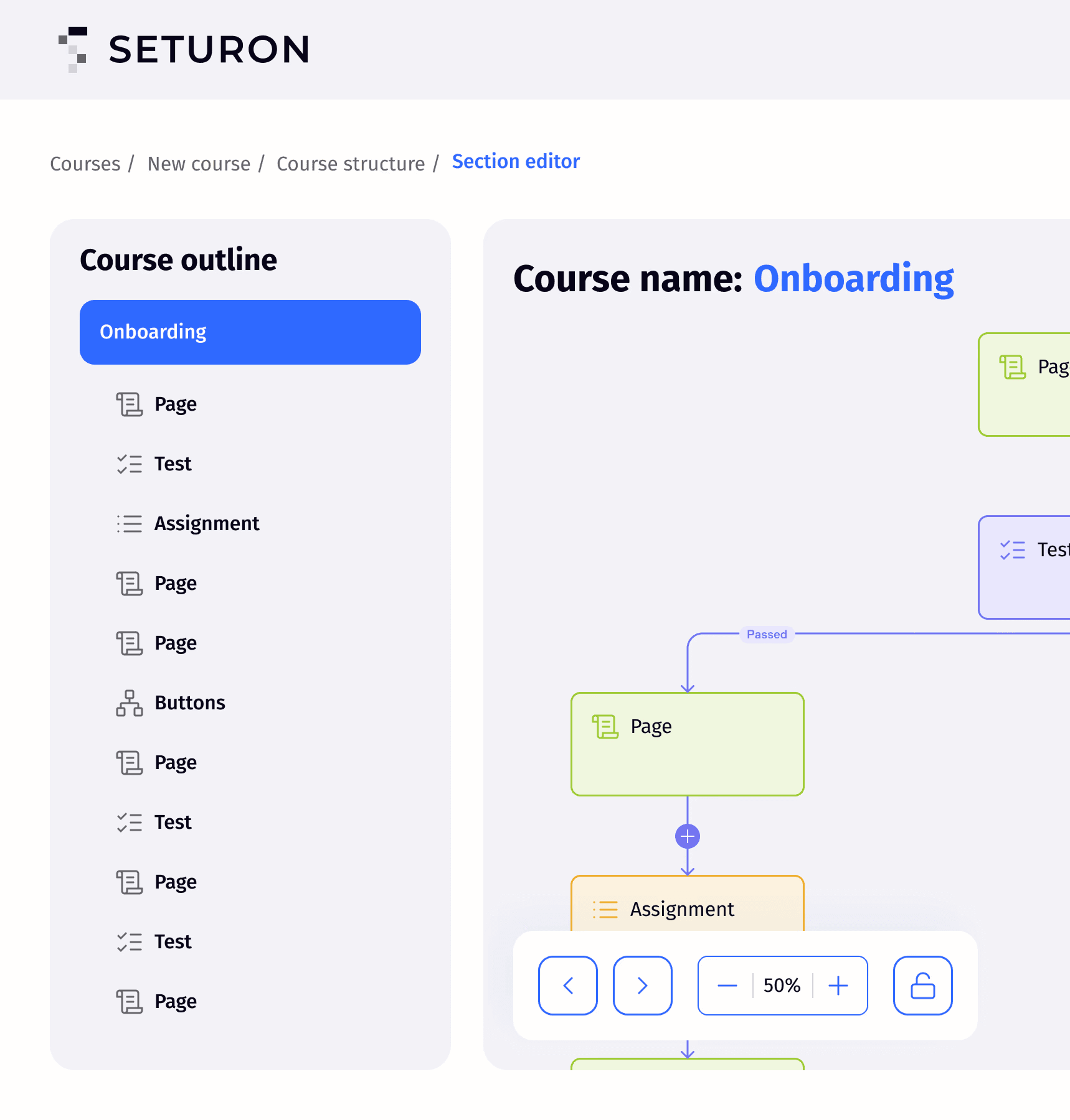
The sidebar was flat. You couldn't drill into a section, and nothing signalled that a section even had an inside.
Icons and own board for sections
I added an arrow icon to sections, signalling you can go deeper, and a counter showing how many blocks a section holds. Clicking a section opens its own board, showing its contents as a workspace of their own.
What changed
Creators could finally see that a section had an inside and how much was in it without opening anything.
No room to actually work
Problem
The sidebar was fixed, and between it, the header, and the controls, there was barely any canvas left, especially on smaller screens, where the course structure had almost nowhere to live.

Full-screen board and floating elements
I made the board full-screen and turned the sidebar and controls into floating elements over it.
Insight
I collapsed the sidebar by default to maximise canvas space. Testing showed the opposite problem: users kept getting lost and simply didn't notice it was there.

Final iteration
I flipped it: the sidebar is open by default, with an × in the corner that collapses it into a floating button when the user wants more room.
What is more
I also added new controls: zoom, change history, and a lock to freeze block positions on the board.
And the board now surfaces a list of blocks to start from, so creators never face a blank page.
Connectors nobody understood
Problem
The arrows linking blocks worked badly, and users couldn't figure out how to connect anything at all.
Connection points around the whole perimeter of every block
Connections could leave from anywhere and arrive anywhere, so the structure became a tangle no one could read.
Insight
Testing showed the opposite of what I expected: all that freedom produced chaos.

Four entry points along the top, one exit at the bottom
Constraining the direction of every connection is what made the structure legible.
What is more
I shrank the arrows and added a "+" icon with an "Add new block" tooltip on hover. Previously, there was no way to insert a block between two existing ones.
Renaming buried in a menu
Problem
You had to open a menu first to rename a block. A basic action was hidden behind a step.
Inline editing: the sidebar and on the block
Hovering the name switches the cursor to an I-beam, signalling you can click and type straight away.
What is more
I also worked out the constraints: a character limit, with names over 20 characters truncating and revealing the full name in a tooltip on hover.
Broken block states
Problem
Default, hover, and pressed states were broken across the blocks, and the interface gave no feedback.
Each block type has its own colour and icon
I unified the states across all of them as a part of building the design system the product had never had.
What changed
Every block now tells you what it is and what it's doing: colour and icon for type, consistent states for feedback.
Trade-off
A canvas is far more powerful than a form, but far more expensive to build. Some mechanics went to the backlog, and I had to phase the rollout by block type.
We launched Section, Decision, Test, Assignment, Content, and Certificate first, with Payment, Registration, and SCORM following later.
Worth it: the linear builder contradicted the whole premise of the product, so the added engineering effort bought the product its actual reason to exist.
* Student & admin panels
Beyond the builder, I redesigned the two panels the product runs on: the student panel, where they take a course, and the admin panel, where they add content outside the constructor.
I brought them into line with the new brand and design system, making the experience readable and consistent for both learners and admins.

Student profile and statisctics
Admin reports
Cross-platform: the course, on any screen
* Design system & brand
As the founding designer, I built the product's entire visual foundation from scratch. Before me, Seturon was assembled on the default Material UI. I created the brand from the ground up, a design system of components and patterns the product now runs on, six pages of the marketing site, and the go-to-market materials (banners, presentations) that gave the product a real presence at launch.
* Learnings
On a 0→1 product, the hardest design decisions are also engineering decisions. The canvas only worked because I sequenced it with engineering: deciding what to ship first and what to defer, rather than designing an ideal and handing it over.
What I'd do differently
* Keep reading

